Getting Started with the RICOH Theta-Client-SDK using React Native and React Native Paper
This guide aims to provide a comprehensive introduction to using the RICOH theta-client-SDK in a React Native application, with the help of React Native Paper for UI development. Whether you’re a seasoned developer or new to mobile development, this guide will walk you through the essential steps to get started.
Before we get into the nitty-gritty of this guide, let’s quickly review the three major components of this topic: React Native, React Native Paper, and Theta-Client SDK.
What is React Native?
React Native is an open-source framework developed by Facebook for building mobile applications using JavaScript and React. It allows developers to create natively rendered mobile apps for iOS and Android from a single codebase, making development more efficient and streamlined. Leveraging the power of React’s component-based architecture and state management, React Native offers features such as fast refresh, access to native functionalities through third-party libraries, and a vast ecosystem of pre-built components and libraries.
What is React Native Paper?
Based on Material Design principles, React Native Paper is a top-notch, standard-compliant toolkit that offers a range of modifiable, themable UI components for React Native applications. Its extensive component library, integrated theming support, and adherence to Material Design principles make it simple for developers to create aesthetically pleasing and consistent user experiences.
What is RICOH Theta-Client SDK
The theta-client SDK is a library designed to facilitate the control and interaction with RICOH THETA cameras using the RICOH THETA API v2.1. This SDK enables developers to build applications that can perform a variety of operations with RICOH THETA cameras, such as taking photos and videos, acquiring media files, and managing camera settings and statuses.
Prerequisites
- Fundamental knowledge of JavaScript/TypeScript
- Basic understanding of React Native
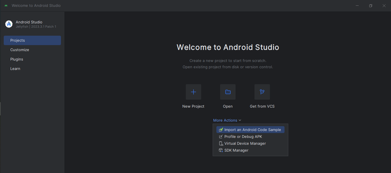
- Using Android Studio for Development Environment Setup
This guide is structured into three main sections:
-
Cloning the theta-client Repository: Step-by-step instructions to clone the theta-client SDK to your local machine.
-
Setting up the Development Environment: Setup process for preparing your development environment using Android Studio.
-
Modifying and Enhancing the React Native Demo with React Native Paper: Instructions on integrating React Native Paper to enhance the UI of your React Native demo application.
Cloning the theta-client Repository to Your Local Machine
Step 1: Navigate to the theta-client Repository
- Open your web browser and go to the theta-client repository on GitHub.
Step 2: Copy the Clone URL
- Click on the “Code” button and copy the clone URL.
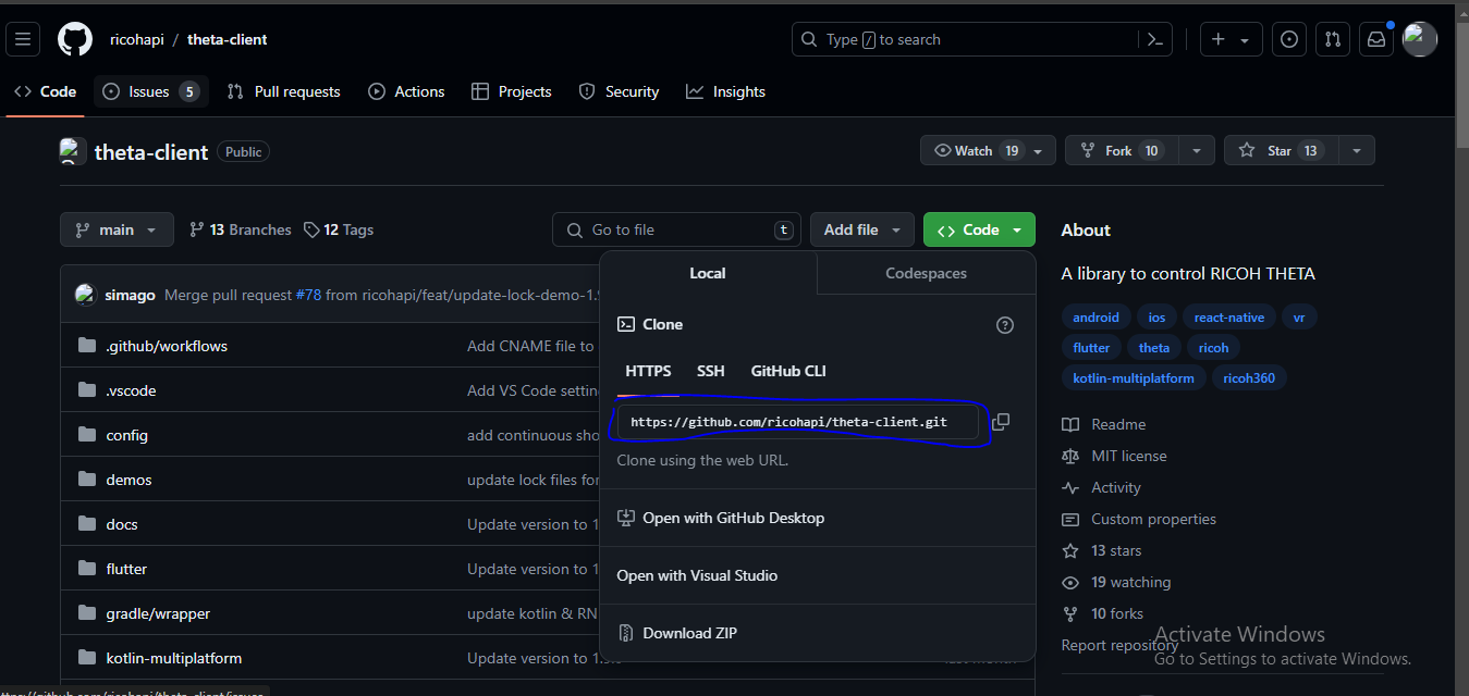
Step 3: Clone the Repository
- Open Git Bash or your terminal on your desktop.
- Navigate to the directory where you want the project to be stored.
- Use the following command to clone the repository:
$ git clone https://github.com/ricohapi/theta-client.git
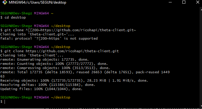
Step 4: Open the Project in Your Text Editor
- Open the cloned project in your text editor, preferably Visual Studio Code.
The way the build directory structure looks:
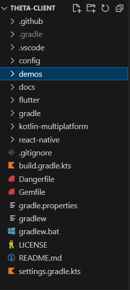
For the sake of this build, our real business is in the “demo-react-native” directory, which is in the “demos” directory.
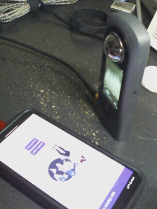
Note: By default, we need a RICOH camera to test the build, but the team that built this SDK already created a solution for cases where the camera is absent.
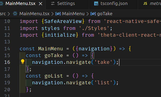
Step 5: Configure the build to be tested even without the RICOH camera.
- Since the essence of this build is to control the THETA camera and we do not have access to the actual THETA camera, we’ll use the fake-theta API.
- Replace the current API endpoint in the
MainMenu.tsxwith the fake API endpoint: https://fake-theta.vercel.app.
From this:
// ... preceding code
const initTheta = async () => {
    const endpoint = 'http://192.168.1.1';
    const config = {
      // clientMode: { // Client mode authentication settings
      //   username: 'THETAXX12345678',
      //   password: '12345678',
      // }
    };
    await initialize(endpoint, config);
    console.log('initialized.');
  };
// ... following code
To this:
// ... preceding code
const initTheta = async () => {
    const endpoint = 'https://fake-theta.vercel.app';
    const config = {
      // clientMode: { // Client mode authentication settings
      //   username: 'THETAXX12345678',
      //   password: '12345678',
      // }
    };
    await initialize(endpoint, config);
    console.log('initialized.');
 };
// ... following code
Following the steps above, you will successfully clone the project and set up the build using the fake API endpoint.
Setting up the Development Environment
In order to speed things up, I won’t dwell much on the details of this since a section of React Native Documentation explicitly covers it.
First, follow the official React Native documentation to set up your development environment: React Native Setup Guide.
While setting up my Virtual Device using Android Studio, I encountered some setbacks, specifically in installing HASM, which I will explain in this section.
As an additional note, I chose Android Studio for my setup since I’m using a Windows Operating System. In the last section of the “setting up environment” from the official React Native Docs, you are required to create a virtual device which you need to install HASM by following the instructions here. But HASM won’t install on your local device unless you’ve enabled some permissions.
Note: To successfully get HASM to install without any fail prompt, you need to enable Virtualization Technology (VT-x). Here are the required steps:
- Enable Virtualization in BIOS:
- For HP Systems (might also apply to other system make, else look it up on Google):
- Restart your computer.
- Press F10 during boot to enter the BIOS setup.
- Navigate to the Advanced Settings.
- Enable Virtualization Technology (VT-x).
- Save and exit the BIOS setup.
- Your system will restart.
- Enable Hyper-V and Windows Virtualization:
- Open the Control Panel.
- Navigate to Programs > Turn Windows features on or off.
- Check the boxes for Hyper-V and Windows Hypervisor Platform.
- Click OK and restart your computer if prompted.
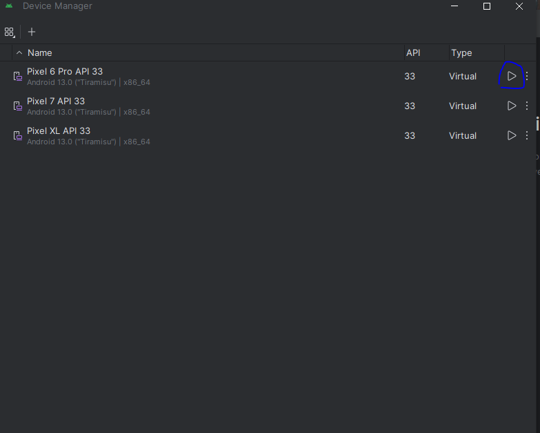
If you follow the steps for setting up the environment and also got HASM successfully installed then you can go ahead to create your Virtual device manager - you can follow the steps here for that.
Launch your Android Studio and then open up the virtual device you installed.
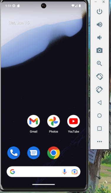
When you click on the play button, it launches the Virtual Device.
Modifying the build using React Native Paper
When you open certain files in the project, you might notice red lines indicating errors. These errors occur because the required modules have not yet been installed. To resolve this, you need to install all the necessary packages. Follow these steps to ensure a smooth setup:
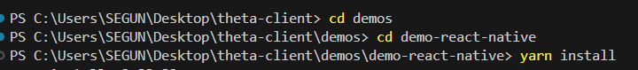
- Ensure you are in the Correct Directory:
- Navigate to the
demos-react-nativedirectory where the demo project is located.
$ cd demos/demo-react-native - Navigate to the
-
Install the Required Packages:
- Run the following command to install all the dependencies needed for the demo to work perfectly:
$ yarn install -
Install React Native Paper:
- Add React Native Paper to your project by running:
$ yarn add react-native-paper -
Install Required Peer Dependencies:
- React Native Paper requires certain peer dependencies. Install them using:
$ yarn add react-native-vector-icons react-native-safe-area-context
Now that we’ve installed the necessary React Native Paper package, let’s modify the build using it.
Integrating React Native Paper
Since App.tsx is the root file in this build, we can wrap our application with the PaperProvider from React Native Paper. The PaperProvider component supplies the theme to all the components within the framework and functions as a portal for components that need to be rendered at the top level.
Here’s how you can integrate PaperProvider into your App.tsx:
-
Import
PaperProvider:- First, import
PaperProviderat the top of yourApp.tsxfile.
import React from 'react'; import { Provider as PaperProvider } from 'react-native-paper'; import { NavigationContainer } from '@react-navigation/native'; import { createStackNavigator } from '@react-navigation/stack'; import MainMenu from './MainMenu'; import TakePhoto from './TakePhoto'; import ListPhotos from './ListPhotos'; import PhotoSphere from './PhotoSphere' // ... following code - First, import
-
Wrap Your
AppwithPaperProvider:- Use PaperProvider to wrap the entire application inside the App function. This ensures that all components have access to the theme provided by React Native Paper.
// ... preceding code
const App = () => {
  return (
    <PaperProvider>
      <NavigationContainer>
        <Stack.Navigator screenOptions={screenOptions}>
          <Stack.Screen
            options={{title: 'Theta SDK Sample App'}}
            name="main"
            component={MainMenu}
          />
          <Stack.Screen
            options={{title: 'Take Photo'}}
            name="take"
            component={TakePhoto}
          />
          <Stack.Screen
            options={{title: 'List Photos'}}
            name="list"
            component={ListPhotos}
          />
          <Stack.Screen
            options={{title: 'Sphere'}}
            name="sphere"
            component={PhotoSphere}
          />
        </Stack.Navigator>
      </NavigationContainer>
    </PaperProvider>
  );
}
// ... following code
This is what your App function should look like after incorporating PaperProvider. By doing this, you ensure that the React Native Paper components have the necessary theme context, enhancing your application’s overall styling and functionality.
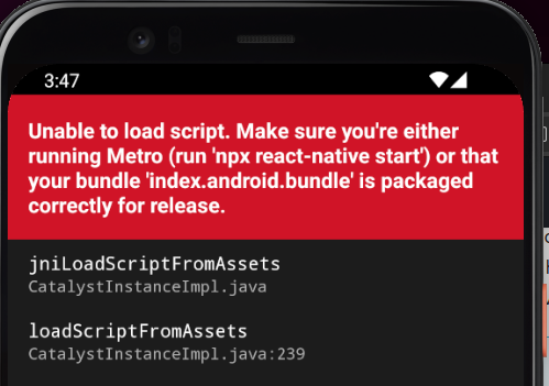
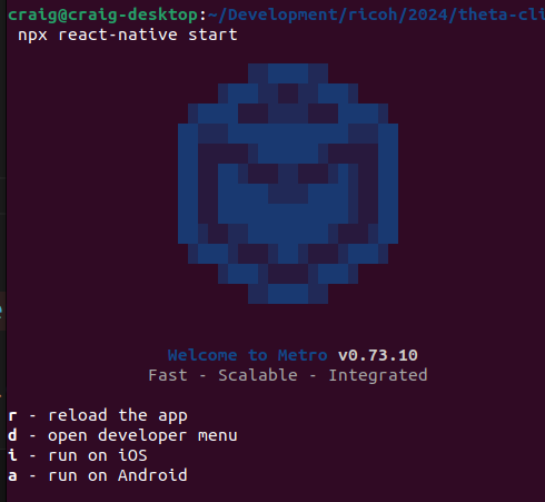
Now, let’s run the build using the command below:
$ yarn android
Note: Make sure your Virtual Device is running!
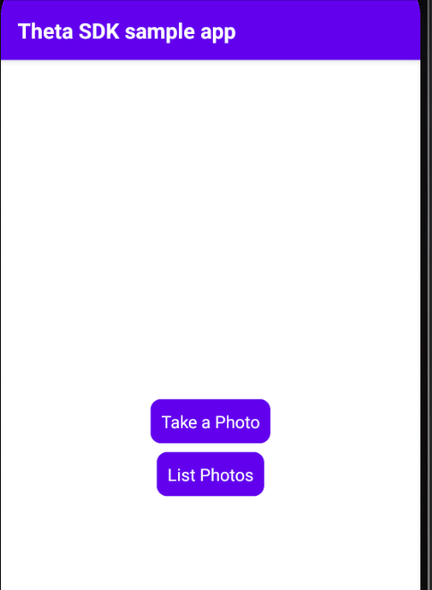
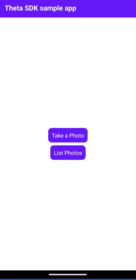
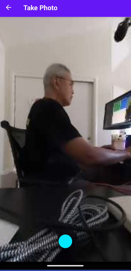
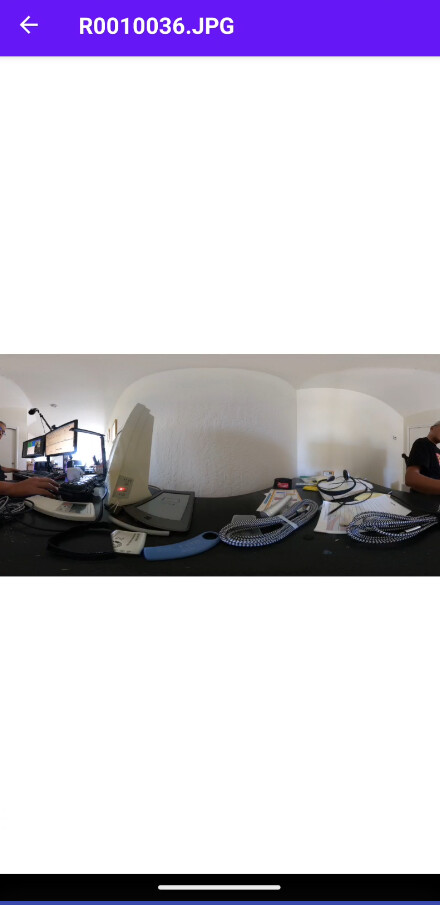
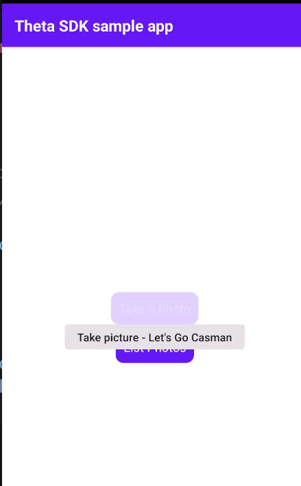
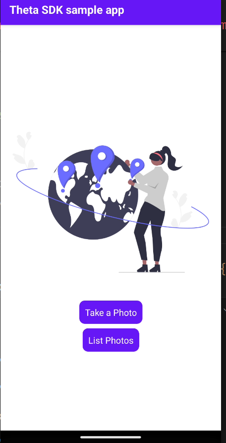
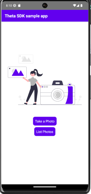
When the build runs successfully, you get this:
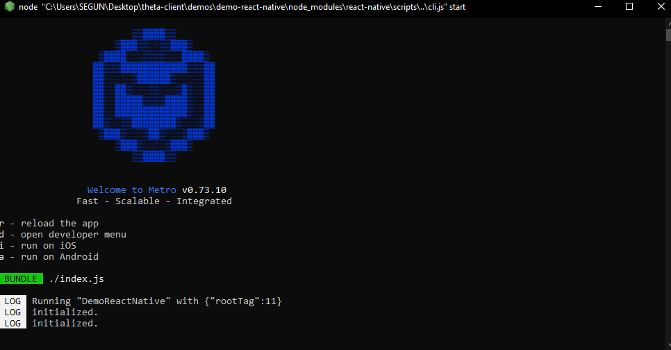
And this will be what you get on your virtual device:
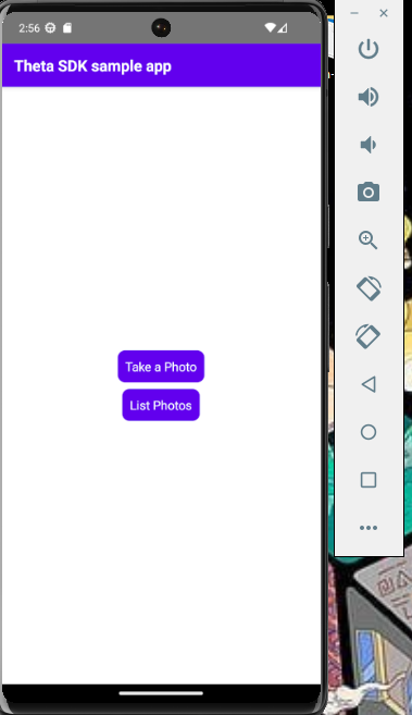
Using React Native Paper to Enhance the Demo Build
After installing the necessary packages and wrapping our components to utilize styles from React Native Paper, the next step is deciding how to enhance the current demo build.
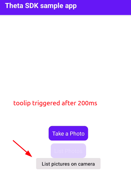
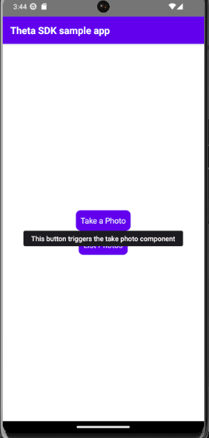
Objective 1: Adding a PopOver to the Buttons
We aim to add a tooltip to the buttons on long press. We’ll use the Tooltip component from React Native Paper. This enhancement will provide users with additional information when they long-press the buttons.
Here are the steps to implement Tooltips
-
Navigate to
MainMenu.tsxinside thesrcfolder:- Open the
MainMenu.tsxfile in your code editor.
- Open the
-
Import the Tooltip Component:
- First, import the Tooltip component from React Native Paper at the top of the file.
$ import { Tooltip } from 'react-native-paper'; -
Wrap the Buttons (“Take a Photo” and “List Photos”) with Tooltip:
- Next, wrap the existing buttons with the
Tooltipcomponent and provide appropriate titles and delays.
// ... preceding code <Tooltip title="This button triggers the take photo component" enterTouchDelay={200} leaveTouchDelay={200}> <TouchableOpacity style={styles.buttonBack} onPress={goTake}> <Text style={styles.button}>Take a Photo</Text> </TouchableOpacity> </Tooltip> <View style={styles.spacer} /> <Tooltip title="This button lists the current photos" enterTouchDelay={200} leaveTouchDelay={200}> <TouchableOpacity style={styles.buttonBack} onPress={goList}> <Text style={styles.button}>List Photos</Text> </TouchableOpacity> </Tooltip> // ... following code - Next, wrap the existing buttons with the
In the code snippet above, we imported the tooltip component and also used it to wrap the buttons to add a popover feature that gives a simple description of the buttons’ functions.
- Tooltip Component: The
Tooltipcomponent from React Native Paper provides a way to display additional information when a user long-presses a button. We have used thetitleprop to specify the tooltip text andenterTouchDelayandleaveTouchDelayto control thetooltipdisplay timing. - Button Wrapping: Each
TouchableOpacitybutton is wrapped inside aTooltipcomponent to enhance user interaction by providing context about the button’s function.
I believe your build is still running actively. If so, save the new changes and test the newly added popover feature.
Objective 2: Enhancing the First Page with an Illustration
To make the first page of our app more attractive, we will add an illustration from undraw.co. Follow these steps to integrate the SVG illustration into your React Native project.
Step 1: Downloading an Illustration
- Open your browser and go to undraw.co.
- Search for a camera illustration, edit the color (#6200ee) to tally with that of the buttons, and download the SVG version of the first illustration you see.
Edit color to tally with buttons snapshot
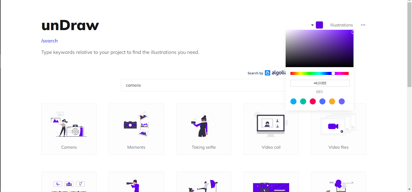
Download svg snapshot
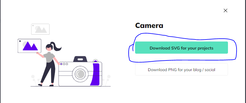
- Save the SVG file in a temporary location on your computer; we’ll integrate it into the build later.
Step 2: Setting Up React Native to Use SVG Files
To use SVG files in React Native, follow these steps:
-
Install Required Packages:
- Run the following command to install
react-native-svgandreact-native-svg-transformer:
$ yarn add react-native-svg react-native-svg-transformer - Run the following command to install
-
Configure Metro to Support SVG Files:
- Navigate to the
metro.config.jsfile in your project and update it as follows:
/** * Metro configuration for React Native * https://github.com/facebook/react-native * * @format */ const { getDefaultConfig } = require("metro-config"); module.exports = (async () => { const { resolver: { sourceExts, assetExts }, } = await getDefaultConfig(); return { transformer: { getTransformOptions: async () => ({ transform: { experimentalImportSupport: false, inlineRequires: true, }, }), babelTransformerPath: require.resolve('react-native-svg-transformer'), }, resolver: { assetExts: assetExts.filter(ext => ext !== "svg"), sourceExts: [...sourceExts, "jsx", "js", "svg", "ts", "tsx"], }, }; })(); - Navigate to the
-
Add TypeScript Declarations for SVG:
- Create a folder named
typesinside thedemo-react-nativedirectory. - Inside the
typesfolder, create a file nameddeclarations.d.tsand add the following code:
declare module "*.svg" { import React from "react"; import { SvgProps } from "react-native-svg"; const content: React.FC<SvgProps>; export default content; } - Create a folder named
-
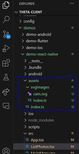
Organize SVG Assets:
- Create an assets folder inside the
demo-react-nativedirectory. - Create another folder named
svgImagesinside the assets folder. - Move your downloaded SVG file into the
svgImagesfolder and rename it tocam.svg. - Inside the
svgImagesfolder, create anindex.tsfile with the following code:
import Cam from './cam.svg'; export { Cam };- In the
assetsfolder, create anindex.tsfile and add this line of code:
export * from './svgImages'; - Create an assets folder inside the
Step 3: Integrating the SVG into MainMenu.tsx
-
Import the SVG:
- In
MainMenu.tsx, import theCamSVG:
import { Cam } from '../assets'; - In
-
Render the SVG:
- Modify the return statement of your
MainMenucomponent to include the SVG:
// ... preceding code return ( <SafeAreaView style={styles.container}> <StatusBar barStyle="light-content" /> <Cam width={350} height={350} /> <Tooltip title="This button triggers the take photo component" enterTouchDelay={200} leaveTouchDelay={200}> <TouchableOpacity style={styles.buttonBack} onPress={goTake}> <Text style={styles.button}>Take a Photo</Text> </TouchableOpacity> </Tooltip> <View style={styles.spacer} /> <Tooltip title="This button lists the current photos" enterTouchDelay={200} leaveTouchDelay={200}> <TouchableOpacity style={styles.buttonBack} onPress={goList}> <Text style={styles.button}>List Photos</Text> </TouchableOpacity> </Tooltip> </SafeAreaView> ); // ... following code - Modify the return statement of your
Save the new changes and check out the current view of the build on the virtual device.
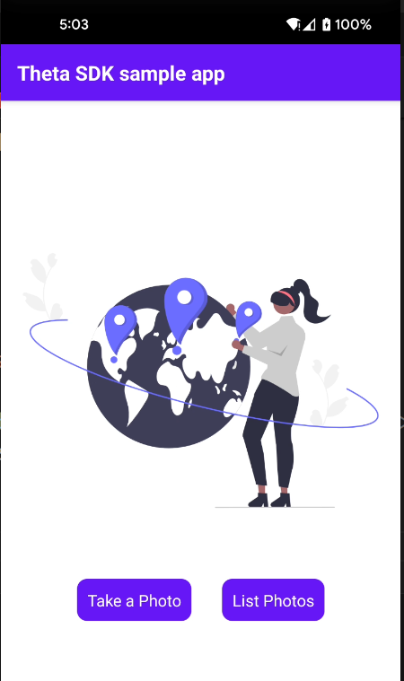
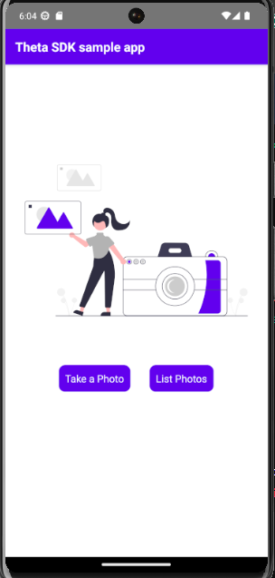
Objective 3: Improving Button Layout
In this section, we will adjust the layout of the buttons (Take a Photo and List Photos) to be in a row. Follow the steps below to implement these changes.
Step 1: Modifying Styles
-
Update the Container Style:
- Open the
Styles.tsxfile inside thesrcfolder. - Modify the container style to the following:
container: { flex: 1, justifyContent: 'flex-start', paddingTop: 100, alignItems: 'center', backgroundColor: 'white', }, - Open the
-
Add a New Style for Button Wrapper:
- Add a new style to handle the button layout:
buttonWrapper: {
    marginTop: 20,
    flexDirection: 'row',
    gap: 15,
},
Step 2: Implementing the New Button Wrapper Styles in MainMenu.tsx.
- Wrap the Buttons with a View Component:
- Navigate to MainMenu.tsx.
- Wrap the existing buttons with a View component and apply the buttonWrapper style to it.
// ... preceding code
<View style={styles.buttonWrapper}>
    <Tooltip title="This button triggers the take photo component"
        enterTouchDelay={200} leaveTouchDelay={200}>
        <TouchableOpacity style={styles.buttonBack} onPress={goTake}>
            <Text style={styles.button}>Take a Photo</Text>
        </TouchableOpacity>
    </Tooltip>

    <View style={styles.spacer} />

    <Tooltip title="This button lists the current photos"
        enterTouchDelay={200} leaveTouchDelay={200}>
        <TouchableOpacity style={styles.buttonBack} onPress={goList}>
            <Text style={styles.button}>List Photos</Text>
        </TouchableOpacity>
    </Tooltip>
</View>
// ... following code
An overview of what the steps in this section did:
- Container Style: The
containerstyle is updated to position the content appropriately, adding padding at the top and aligning items to the center. - Button Wrapper Style: A new
buttonWrapperstyle is added to arrange the buttons in a row with a gap between them.
In addition, the buttons are now wrapped inside a View component with the buttonWrapper style applied, aligning them horizontally.
Save the newly added changes and preview the build.
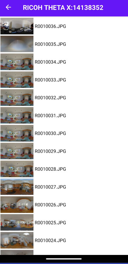
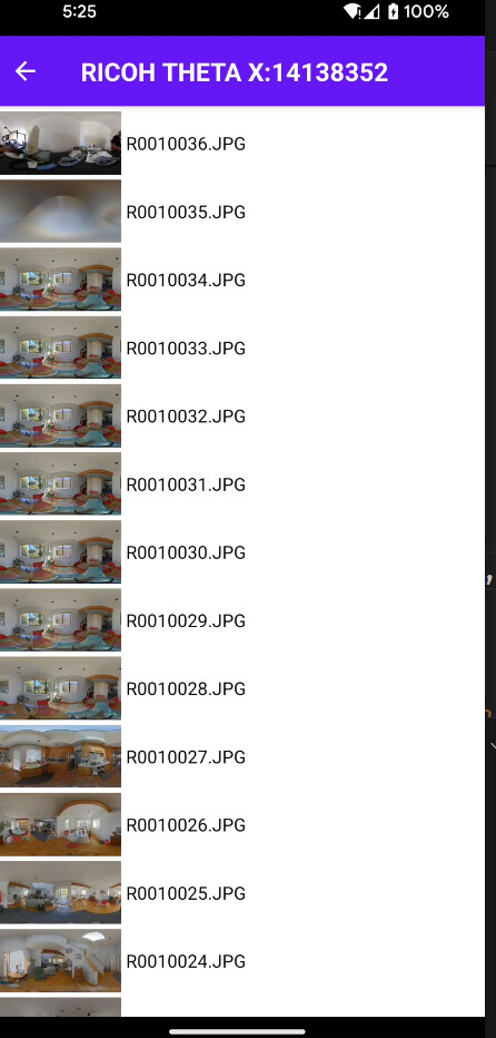
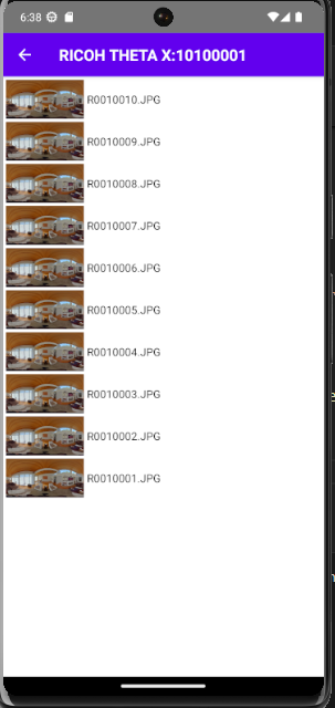
Next, we want to make the photos in the ListPhotos component into an individual card-like structure. But before we do this, click on the “List Photos” button, which will take you to the “List Photos” page, and you will notice that the list didn’t start from the top. This is due to modifying the container styles, which the ListPhotos component is also using.
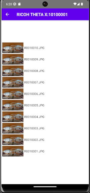
To fix this, navigate to the Styles.tsx and create a new style named listContainer:
listContainer: {
    flex: 1,
    justifyContent: 'center',
    alignItems: 'center',
    backgroundColor: 'white',
},
Next, apply this newly created style to the ListPhotos component.
- Open the
ListPhotos.tsxfile. - Change the style applied to the
SafeAreaViewcontainer fromcontainerto the newly createdlistContainer.
<SafeAreaView style={styles.listContainer} edges={['left', 'right', 'bottom']}>
  <StatusBar barStyle="light-content" />
  <ScrollView
    refreshControl={
      <RefreshControl refreshing={refreshing} onRefresh={onRefresh} />
    }>
    {items}
  </ScrollView>
 </SafeAreaView>
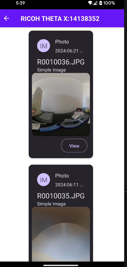
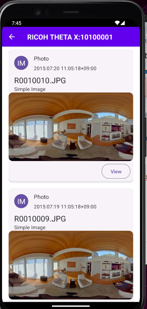
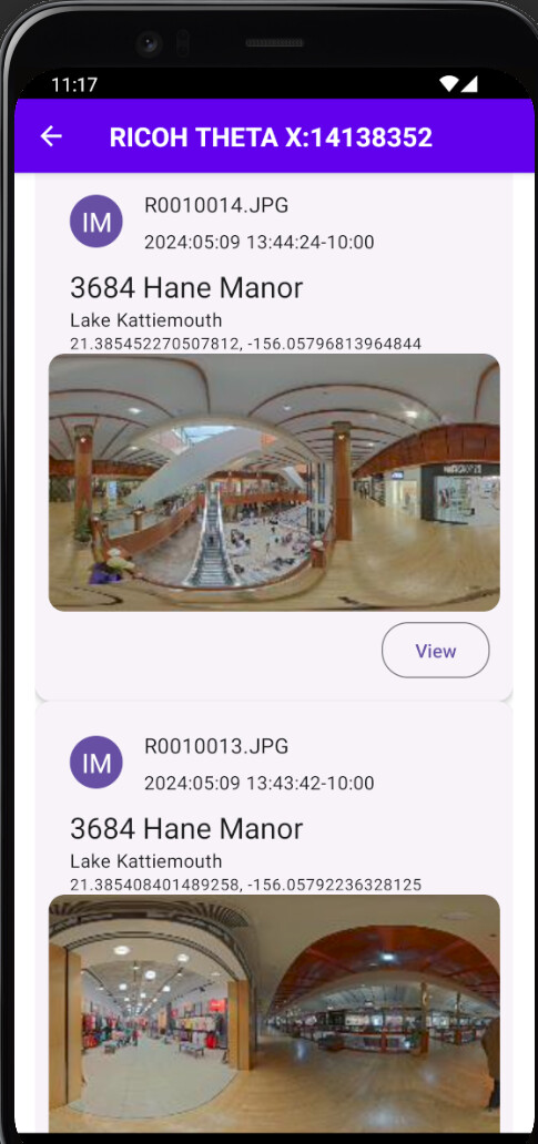
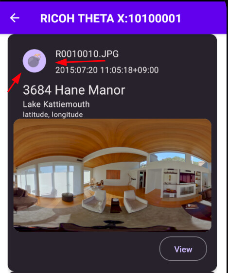
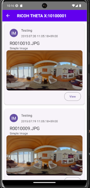
Objective 4: Enhance the Photo List with a Card-Like Structure and Shimmer Effect.
In this segment, we will enhance the ListPhotos component by displaying each photo in a card-like structure using the Card component from React Native Paper. Additionally, we’ll add a shimmer effect to improve the visual appeal.
Step 1: Import the needed Components
First, import the necessary components from React Native Paper:
import { Avatar, Button, Card, Text as Tex } from 'react-native-paper';
Note: To avoid conflicts between the
Textcomponent from React Native and the one from React Native Paper, we alias the latter asTex.
Step 2: Update the Items Rendering
Next, update the items expression to use the card structure. Replace the current implementation with the following:
const LeftContent = props => <Avatar.Text size={40} label="IM" />;

const items = files.map(item => (
  <TouchableOpacity
    style={styles.fileItemBase}
    key={item.name}
    onPress={() => onSelect(item)}>
  >
    <Card>
      <Card.Title
        title="Photo"
        subtitle={item.dateTimeZone}
        left={LeftContent}
      />
      <Card.Content>
        <Tex variant="titleLarge">{item.name}</Tex>
        <Tex variant="bodyMedium">{item?.imageDescription || 'Simple Image'}</Tex>
      </Card.Content>
      <Card.Cover source={{ uri: item.thumbnailUrl }} />
      <Card.Actions>
        <Button onPress={() => onSelect(item)}>View</Button>
      </Card.Actions>
    </Card>
  </TouchableOpacity>
));
Step 3: Update the Button onPress Event
Move the onPress event from the TouchableOpacity to the Button (View) inside the card:
<Card.Actions>
  <Button onPress={() => onSelect(item)}>View</Button>
</Card.Actions>
Step 4: Create Styles for the Card Component
Add the following styles to your Styles.tsx file to enhance the card’s appearance:
scrollViewContent: {
  alignItems: 'center',
},
cardWrapper: {
  width: '95%',
  marginVertical: 10,
},
card: {
  padding: 10,
},
Step 5: Integrate the new Styles into the ListPhotos Component.
We are adding two of the newly created styles—card and cardWrapper—to the Items function.
The TouchableOpacity style:
// replace style={styles.fileItemBase} with style={styles.cardWrapper}
// ... preceding code
<TouchableOpacity
  style={styles.cardWrapper}
  key={item.name}
>
    // the code
</TouchableOpacity>
// ... following code
The Card component itself:
// ... preceding code
<Card style={styles.card}>
// code
</Card>
// ... following code
Set the contentContainerStyle for the ScrollView inside the SafeAreaView component:
<ScrollView
refreshControl={<RefreshControl refreshing={refreshing} onRefresh={onRefresh} />
    } contentContainerStyle={styles.scrollViewContent}>
    { items }
</ScrollView>
Save all the changes and preview the build.
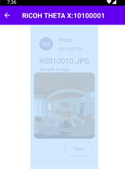
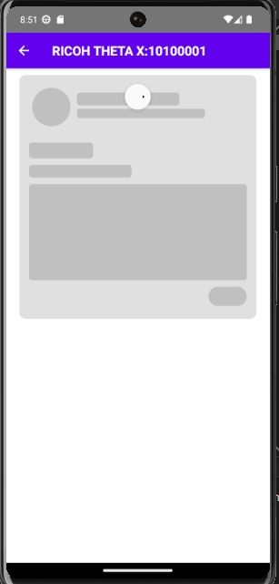
Adding a Shimmer Effect to Display a Skeleton UI While Loading Photos
When you click the “List Photos” button, it takes you to the Photos list page. However, there can be a delay before the photos load. To improve the user experience, we want to display a skeleton UI with a linear gradient animation to indicate that data is being loaded. This is better than leaving the screen blank while waiting for the images to load.
Step 1: Install the Required Package
First, we need to install the react-native-linear-gradient package. Run the following command:
$ yarn add react-native-linear-gradient
Step 2: Create the Skeleton UI
We will create a skeleton UI that mimics the structure of the card component displayed in the Photos list page.
- Create a new file inside the
srcfolder and name itSkeletonCardLoader.tsx. - Inside
SkeletonCardLoader.tsx, import the necessary modules and define the skeleton UI. Here, we will make use of theViewcomponent and try as much to build up aCard-likestructure just like the one in theListPhotoscomponent.
Here is the finished code of the Skeleton UI, look through it, just to add, it is just a basic structure.
import React from 'react';
import { StyleSheet, View } from 'react-native';
import LinearGradient from 'react-native-linear-gradient';

const SkeletonCardLoader = () => {
  return (
    <View style={styles.cardWrapper}>
      <View style={styles.card}>
        {/* Header section */}
        <View style={styles.header}>
          <View style={styles.avatar} />
          <View>
            <View style={styles.title} />
            <View style={styles.subtitle} />
          </View>
        </View>
        <View style={{ marginTop: 10 }}>
          <View style={styles.name} />
          <View style={styles.description} />
        </View>
        <View style={styles.image} />
        <View style={styles.actions} />
      </View>
    </View>
  );
};

const styles = StyleSheet.create({
  cardWrapper: {
    marginVertical: 10,
  },
  card: {
    height: 380,
    backgroundColor: '#e0e0e0',
    borderRadius: 10,
    overflow: 'hidden',
    position: 'relative',
    padding: 10,
    marginBottom: 10,
    width: '95%',
  },
  header: {
    flexDirection: 'row',
    alignItems: 'center',
  },
  avatar: {
    height: 60,
    width: 60,
    backgroundColor: '#c0c0c0',
    margin: 10,
    borderRadius: 30,
  },
  title: {
    height: 20,
    width: 160,
    backgroundColor: '#c0c0c0',
    borderRadius: 5,
    marginBottom: 5,
  },
  subtitle: {
    height: 15,
    width: 200,
    backgroundColor: '#c0c0c0',
    borderRadius: 5,
    marginBottom: 5,
  },
  name: {
    height: 25,
    width: 100,
    backgroundColor: '#c0c0c0',
    margin: 5,
    borderRadius: 5,
  },
  description: {
    height: 20,
    width: 160,
    backgroundColor: '#c0c0c0',
    margin: 5,
    borderRadius: 5,
  },
  image: {
    height: 150,
    width: '100%',
    backgroundColor: '#c0c0c0',
    margin: 5,
    borderRadius: 5,
  },
  actions: {
    height: 30,
    width: 60,
    backgroundColor: '#c0c0c0',
    borderRadius: 15,
    alignSelf: 'flex-end',
    margin: 5,
  },
});

export default SkeletonCardLoader;
Step 3: Integrate the Skeleton UI into the Photos List Page
We want to display the skeleton UI when the photos are still loading. This gives the user a visual indication that data is being fetched, preventing them from thinking the app is unresponsive.
- Import the
SkeletonCardLoadercomponent into yourListPhotoscomponent.
import SkeletonCardLoader from './SkeletonCardLoader';
- Use the
refreshingstate to determine if the photos are loaded. Ifrefreshingistrue, display theSkeletonCardLoader; otherwise, display the actual photos.
Here’s how you can update your ListPhotos component to implement the logic above:
// ... preceding code
return (
    <SafeAreaView style={styles.listContainer} edges={['left', 'right', 'bottom']}>
      <StatusBar barStyle="light-content" />
      <ScrollView
        refreshControl={
          <RefreshControl refreshing={refreshing} onRefresh={onRefresh} />
        } contentContainerStyle={styles.scrollViewContent}>
        {/* the logic */}
        {
          refreshing ? (<SkeletonCardLoader/>) : (items)
        }
      </ScrollView>
    </SafeAreaView>
  );
// ... following code
Conditional Rendering: In the ListPhotos component, the refreshing state determines whether to show the SkeletonCardLoader or the actual list of items. When refreshing is true, the skeleton UI is displayed, indicating that data is being loaded.
Save up and preview the build.
Now that we’ve built the basic skeleton UI, the next step is to add a shimmer effect using an animated linear gradient. This effect gives users a loading indication by making it look like a light is sweeping across the elements.
Here is a Step-by-Step approach
- Import Necessary Libraries
First, import the necessary libraries for animation and gradient effects:
import React, { useEffect, useRef } from 'react';
import { StyleSheet, View, Animated } from 'react-native';
import LinearGradient from 'react-native-linear-gradient';
- Create an Animated Value
Create a reference to store the animated value which will drive the shimmer effect:
const animatedValue = useRef(new Animated.Value(0)).current;
- Set Up the Animation Sequence
Use theuseEffecthook to set up the animation sequence. This sequence will continuously loop to create the shimmer effect:
useEffect(() => {
  Animated.loop(
    Animated.sequence([
      Animated.timing(animatedValue, {
        toValue: 1,
        duration: 1500,
        useNativeDriver: true,
      }),
      Animated.timing(animatedValue, {
        toValue: 0,
        duration: 1500,
        useNativeDriver: true,
      }),
    ])
  ).start();
}, [animatedValue]);
- Interpolate the Animated Value
Interpolate the animated value to create a translation effect for the gradient:
const translateX = animatedValue.interpolate({
  inputRange: [0, 1],
  outputRange: [-100, 100],
});
- Define Styles for the Gradient
Add styles for the gradient wrapper and the gradient itself:
const styles = StyleSheet.create({
    // Other styles...
  gradientWrapper: {
    ...StyleSheet.absoluteFillObject,
  },
  gradient: {
    flex: 1,
    width: '200%',
  },
});
- Integrate the Gradient with Animation
Combine theAnimated.ViewandLinearGradientto create the shimmer effect:
<Animated.View
  style={[
    styles.gradientWrapper,
    {
      transform: [{ translateX }],
    },
  ]}
>
  <LinearGradient
    colors={[
      'rgba(255,255,255,0)',
      'rgba(255,255,255,0.5)',
      'rgba(255,255,255,0.6)',
      'rgba(255,255,255,0)',
      'rgba(255,255,255,0.5)',
    ]}
    start={{ x: 0, y: 1 }}
    end={{ x: 1, y: 1 }}
    style={styles.gradient}
  />
</Animated.View>
- Duplicate the Skeleton UI
To fill the vertical height of the device, duplicate the skeleton UI elements. This example duplicates it four times, but you can adjust the number as needed:
return (
    <View style={styles.cardWrapper}>
      {[...Array(4)].map((_, index) => (
      <View key={index} style={styles.card}>
        <View style={styles.header}>
            <View style={styles.avatar}/>
            <View>
                <View style={styles.title} />
                <View style={styles.subtitle} />
            </View>
        </View>
        <View style={{ marginTop: 10}}>
          <View style={styles.name}/>
          <View style={styles.description}/>
        </View>
        <View style={styles.image} />
        <View style={styles.actions} />
        <Animated.View
          style={[
            styles.gradientWrapper,
            {
              transform: [{ translateX }],
            },
          ]}
        >
          <LinearGradient
            colors={[
              'rgba(255,255,255,0)',
              'rgba(255,255,255,0.5)',
              'rgba(255,255,255,0.6)',
              'rgba(255,255,255,0)',
              'rgba(255,255,255,0.5)',
            ]}
            start={{ x: 0, y: 1 }}
            end={{ x: 1, y: 1 }}
            style={styles.gradient}
          />
        </Animated.View>
      </View>
      ))}
    </View>
);
The overall code in the SkeletonCardLoader component:
import React, { useEffect, useRef } from 'react';
import { StyleSheet, View, Animated } from 'react-native';
import LinearGradient from 'react-native-linear-gradient';

const SkeletonCardLoader = () => {
  const animatedValue = useRef(new Animated.Value(0)).current;

  useEffect(() => {
    Animated.loop(
      Animated.sequence([
        Animated.timing(animatedValue, {
          toValue: 1,
          duration: 1500,
          useNativeDriver: true,
        }),
        Animated.timing(animatedValue, {
          toValue: 0,
          duration: 1500,
          useNativeDriver: true,
        }),
      ])
    ).start();
  }, [animatedValue]);

  const translateX = animatedValue.interpolate({
    inputRange: [0, 1],
    outputRange: [-100, 100],
  });

  return (
    <View style={styles.cardWrapper}>
      {[...Array(4)].map((_, index) => (
      <View key={index} style={styles.card}>
        <View style={styles.header}>
            <View style={styles.avatar}/>
            <View>
                <View style={styles.title} />
                <View style={styles.subtitle} />
            </View>
        </View>
        <View style={{ marginTop: 10}}>
          <View style={styles.name}/>
          <View style={styles.description}/>
        </View>
        <View style={styles.image} />
        <View style={styles.actions} />
        <Animated.View
          style={[
            styles.gradientWrapper,
            {
              transform: [{ translateX }],
            },
          ]}
        >
          <LinearGradient
            colors={[
              'rgba(255,255,255,0)',
              'rgba(255,255,255,0.5)',
              'rgba(255,255,255,0.6)',
              'rgba(255,255,255,0)',
              'rgba(255,255,255,0.5)',
            ]}
            start={{ x: 0, y: 1 }}
            end={{ x: 1, y: 1 }}
            style={styles.gradient}
          />
        </Animated.View>
      </View>
      ))}
    </View>
  );
};

const styles = StyleSheet.create({
  cardWrapper: {
    marginVertical: 10,
    // width: '95%',
    // alignItems: 'center',
  },
  card: {
    height: 380,
    backgroundColor: '#e0e0e0',
    borderRadius: 10,
    overflow: 'hidden',
    position: 'relative',
    padding: 10,
    marginBottom: 10,
    width: '95%'
  },
  header: {
    flexDirection: 'row',
    alignItems: 'center'
  },
  avatar: {
    height: 60,
    backgroundColor: '#c0c0c0',
    width: 60,
    margin: 10,
    borderRadius: 50,
  },
  title: {
    height: 20,
    backgroundColor: '#c0c0c0',
    width: 160,
    borderRadius: 5,
    marginBottom: 5,
  },
  subtitle: {
    height: 15,
    width: 200,
    backgroundColor: '#c0c0c0',
    marginBottom: 5,
    borderRadius: 5,
  },
  name: {
    height: 25,
    backgroundColor: '#c0c0c0',
    width: 100,
    margin: 5,
    borderRadius: 5,
  },
  description: {
    height: 20,
    backgroundColor: '#c0c0c0',
    width: 160,
    margin: 5,
    borderRadius: 5,
  },
  image: {
    height: 150,
    backgroundColor: '#c0c0c0',
    margin: 5,
    borderRadius: 5,
  },
  actions: {
    height: 30,
    width: 60,
    marginLeft: 285,
    backgroundColor: '#c0c0c0',
    margin: 5,
    borderRadius: 15,
  },
  gradientWrapper: {
    ...StyleSheet.absoluteFillObject,
  },
  gradient: {
    flex: 1,
    width: '200%',
  },
});

export default SkeletonCardLoader;
While this approach manually creates the shimmer effect, there is a Skeleton Placeholder package that can simplify this process. However, it requires macOS for setup, which is why we opted for this manual implementation.
Conclusion
In this guide, we examined how to use the React Native Paper to add new styles and modifications to the React Native Demo build. Just in case you want to compare your overall code with mine, you can check out the repo here.
If you enjoyed this, please like, share and comment!